Residential
Maison Rouge
In this three-storey home, colour becomes the common thread running throughout the project. Ceramics, wood and a palette of warm tones accompany the vertical journey through the house, connecting the different spaces while allowing each one to retain its own personality.
Pieces used in the project
Pictures of the project
In this project by Sara Molina, founder of Savoir Faire Interior, colour is not conceived as an isolated resource or simply as a decorative element. Its role goes much further: it accompanies the journey through the home’s three floors, establishing a visual connection between spaces with different functions and personalities.
The same chromatic sensibility takes different forms in the kitchen and bathroom. Terracotta, reddish and sandy tones combine with wood to create a warm palette that evolves as we move through the house. Ceramics play a fundamental role in creating this continuity, while also introducing variations in format, geometry, texture and finish.
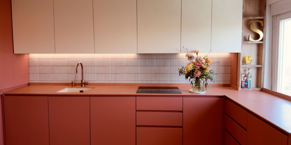
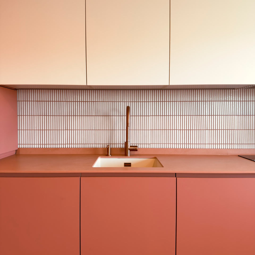
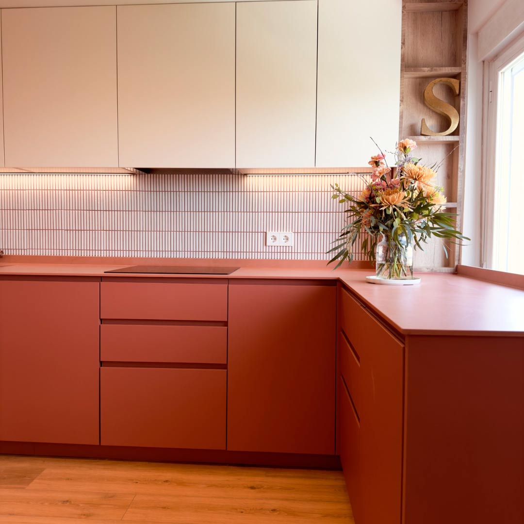
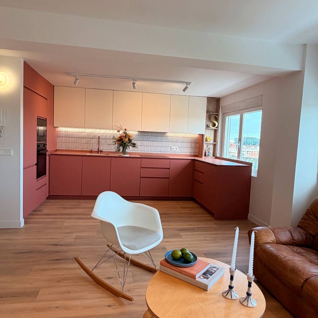
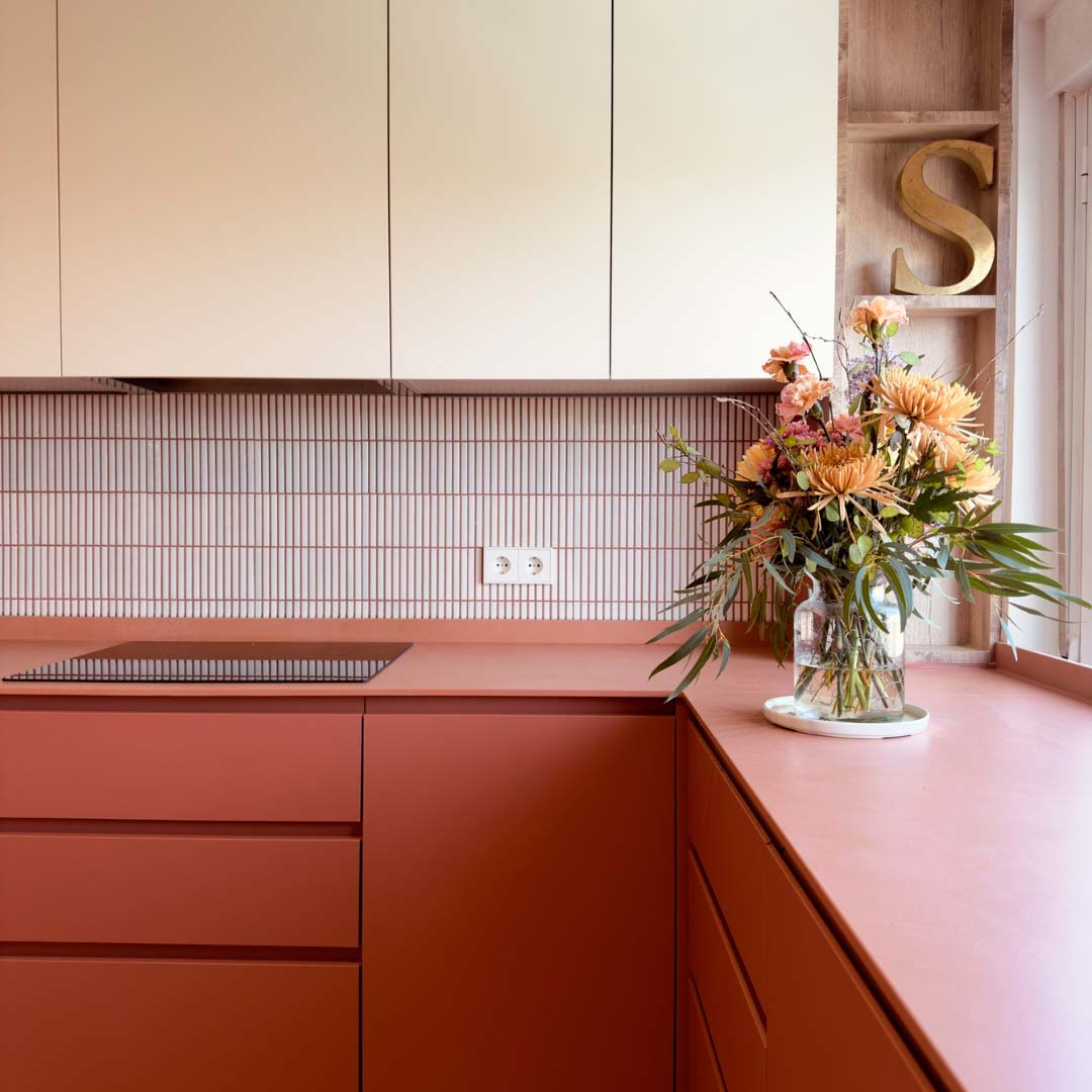
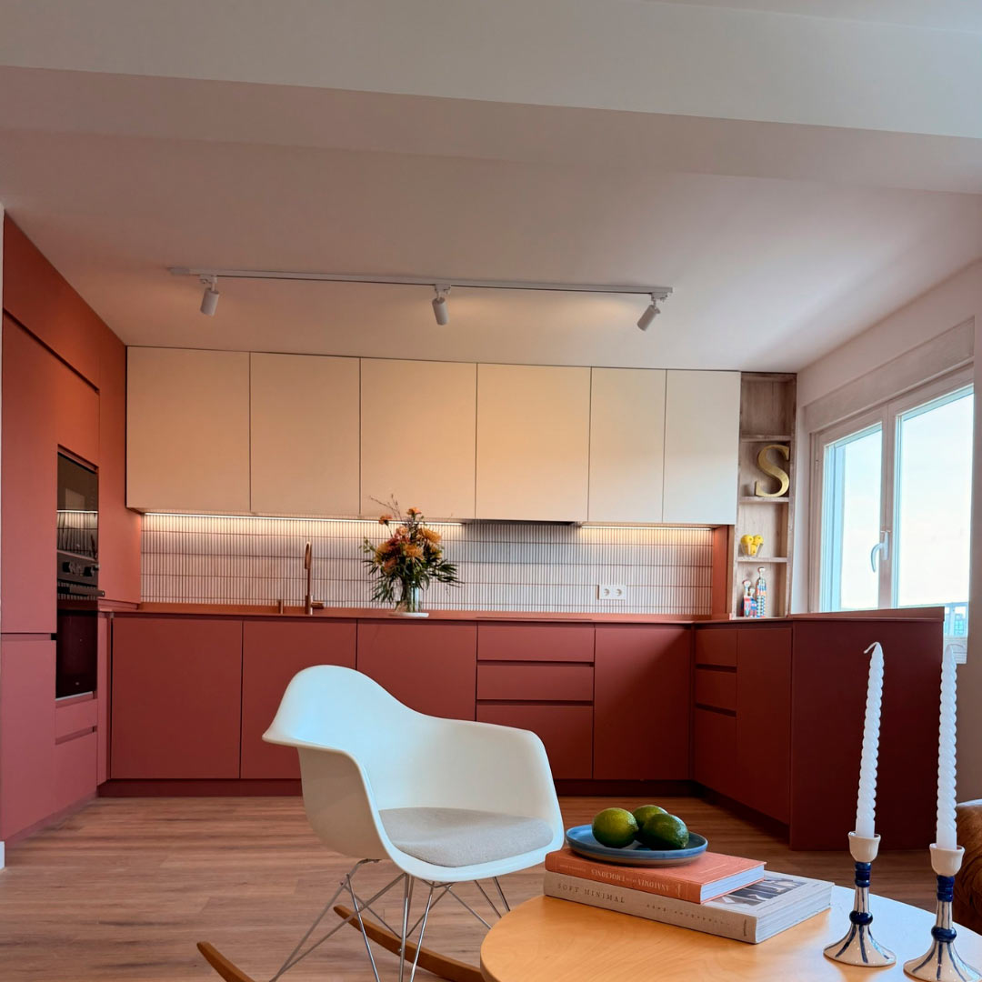
In the kitchen, colour takes on a particularly strong presence. The reddish tones of the cabinetry envelop the space, contrasting with the much lighter upper cabinets.
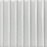
Between them, our Kit-Kat Snow Glossy tile is used for the backsplash. Its small format and vertical lines bring rhythm to the composition, while its glossy finish reflects the light and enhances the brightness of the space. The result is a kitchen with a distinctive identity that also introduces some of the warm tones that reappear elsewhere in the home.
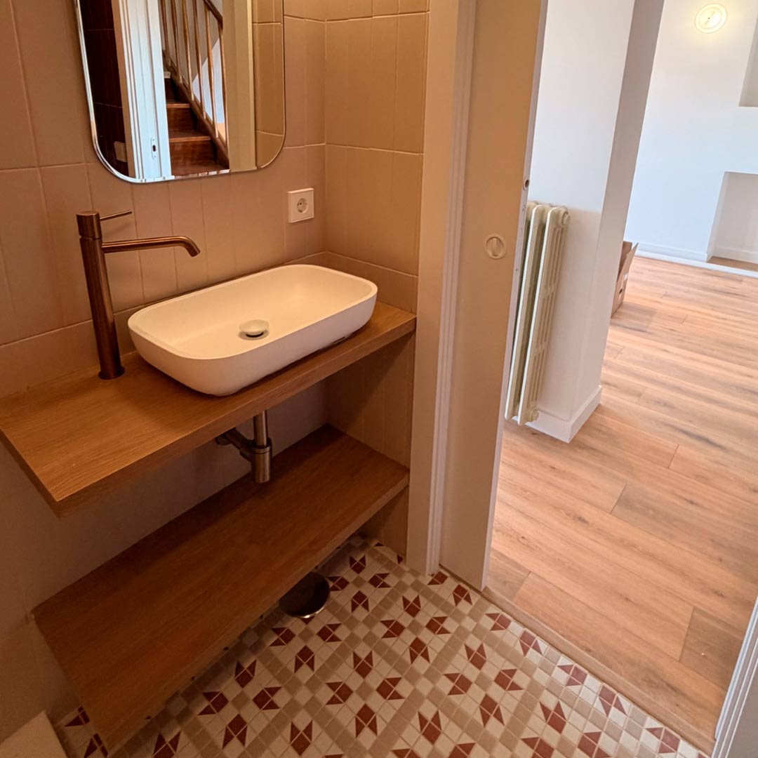
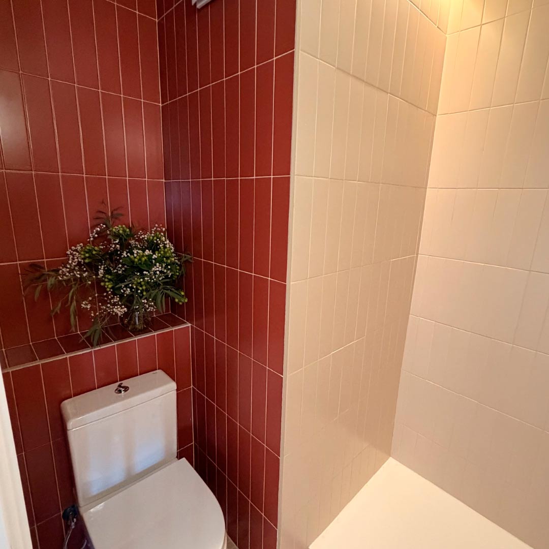
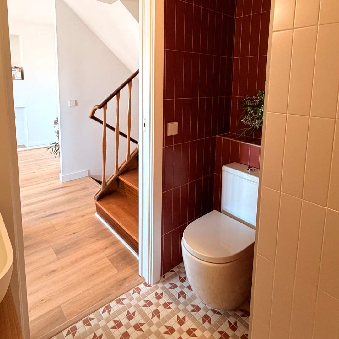
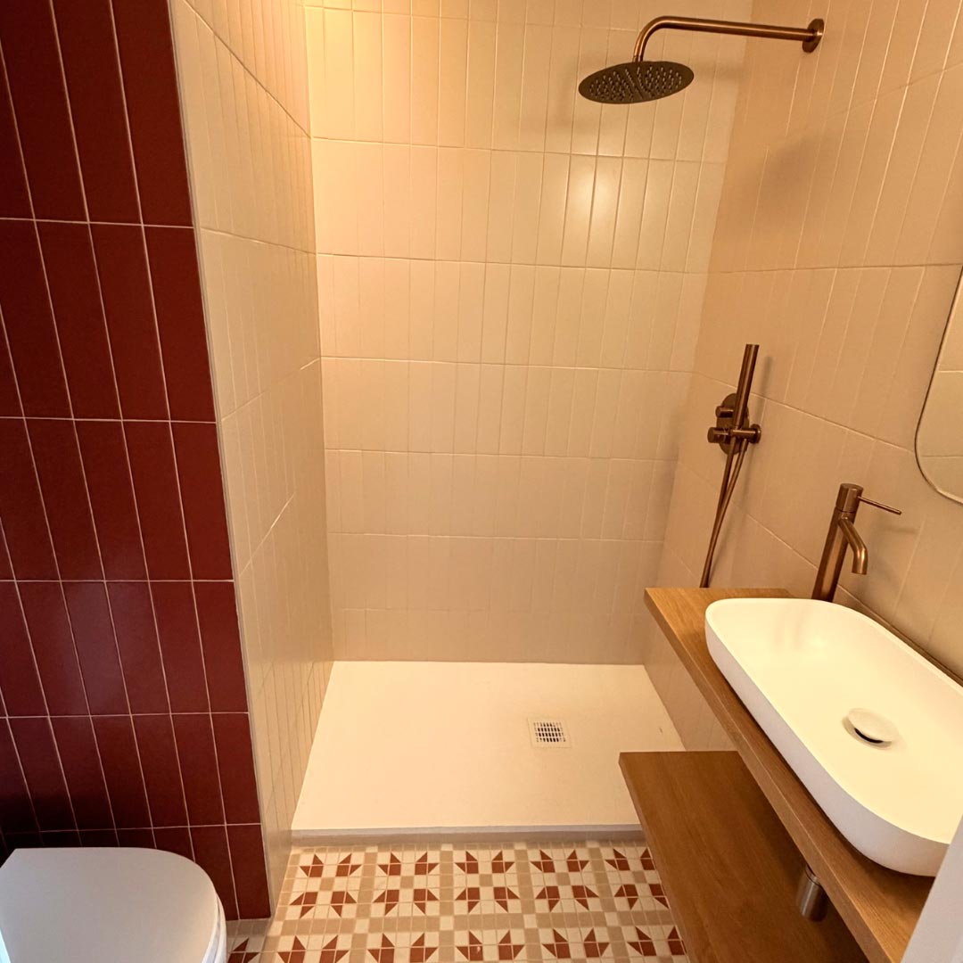
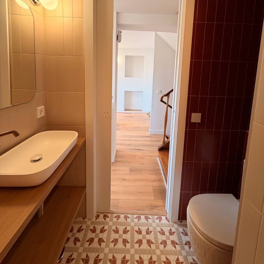
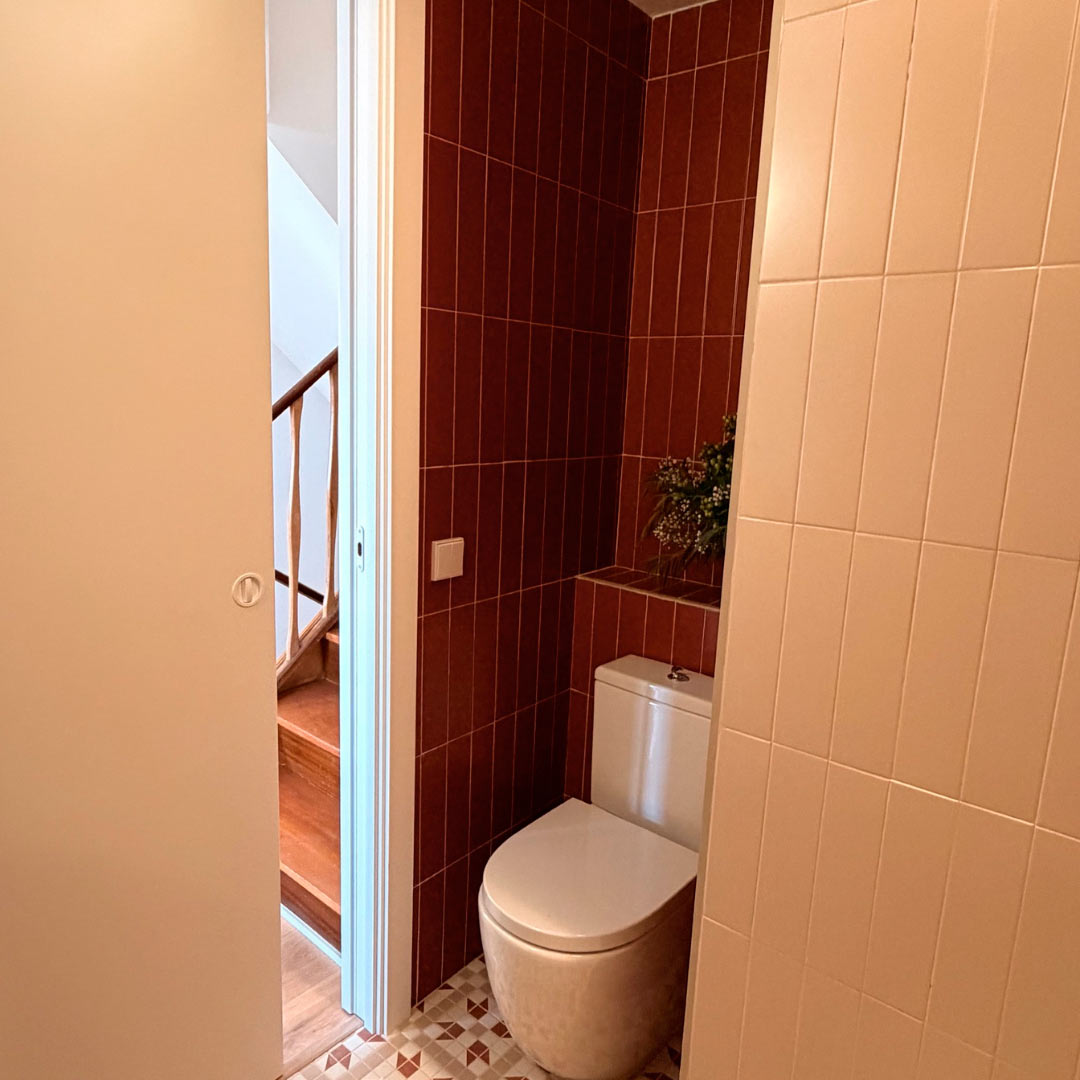
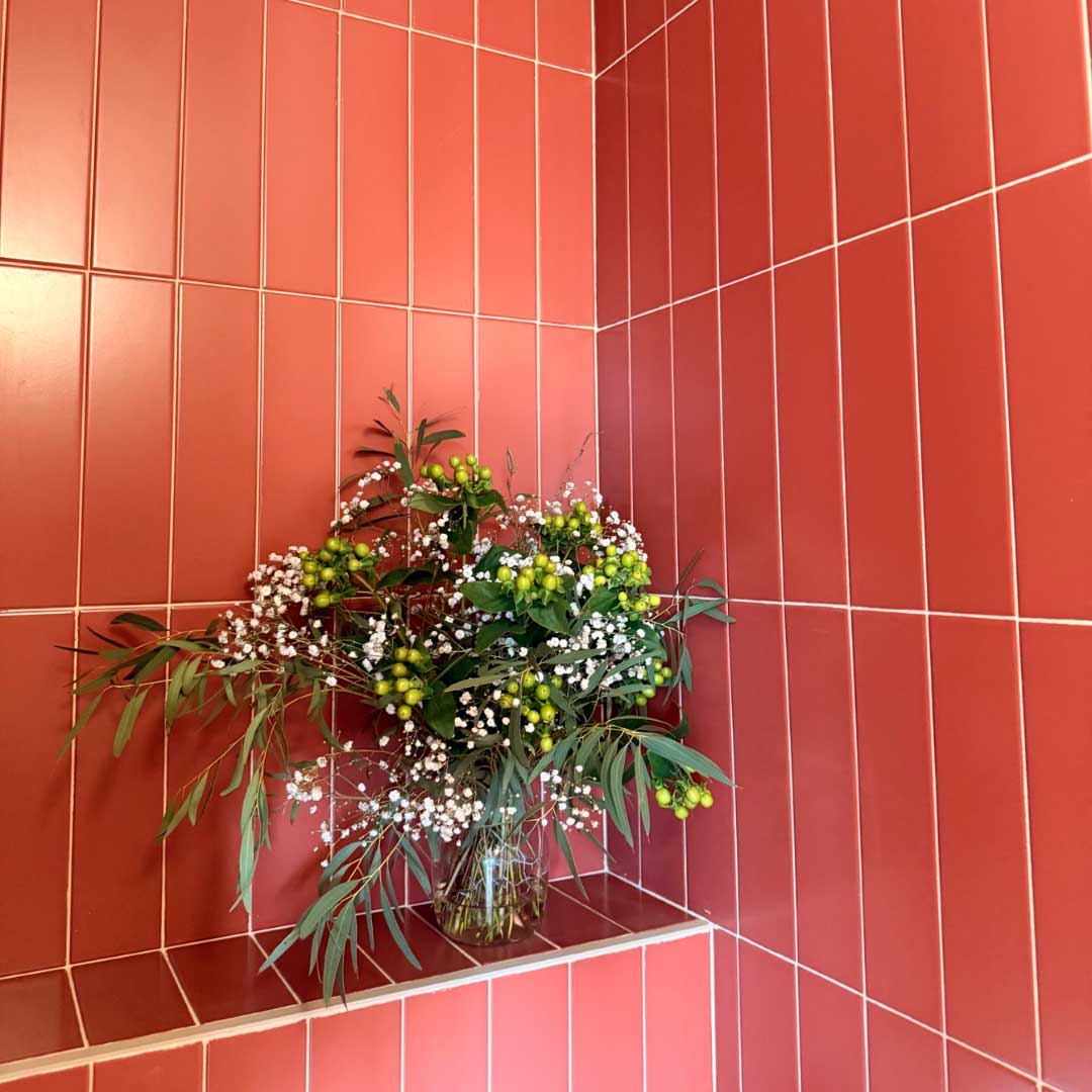
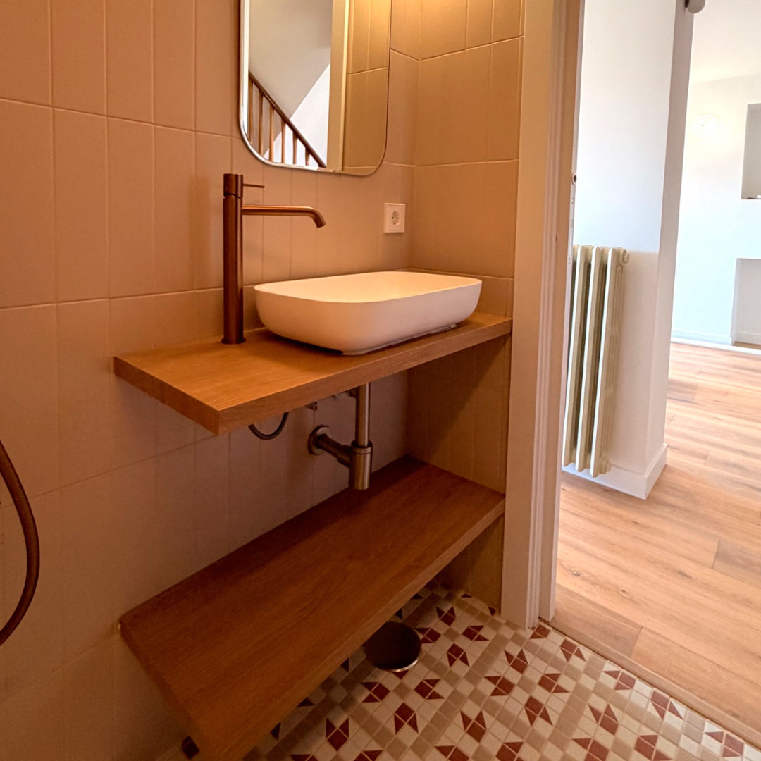
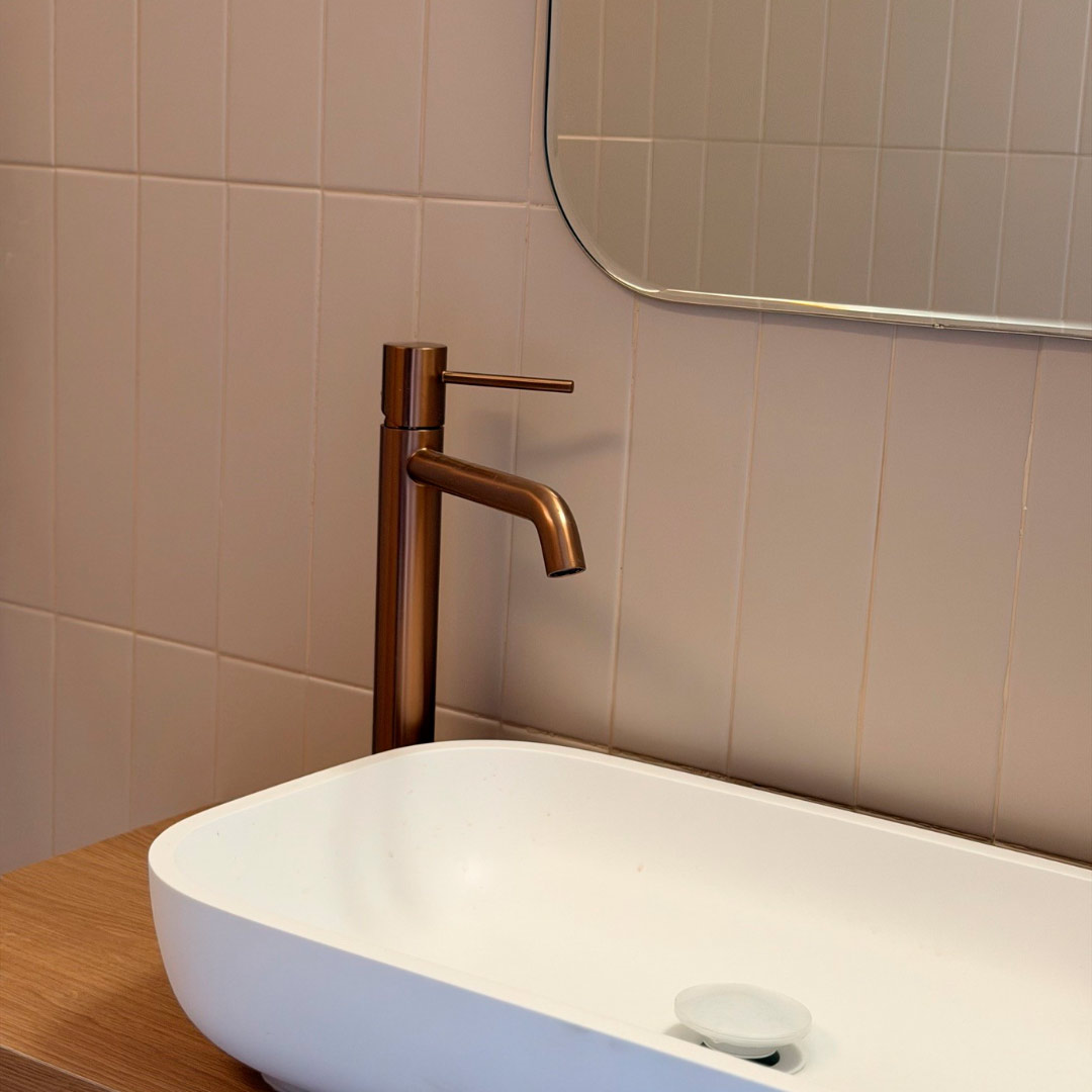
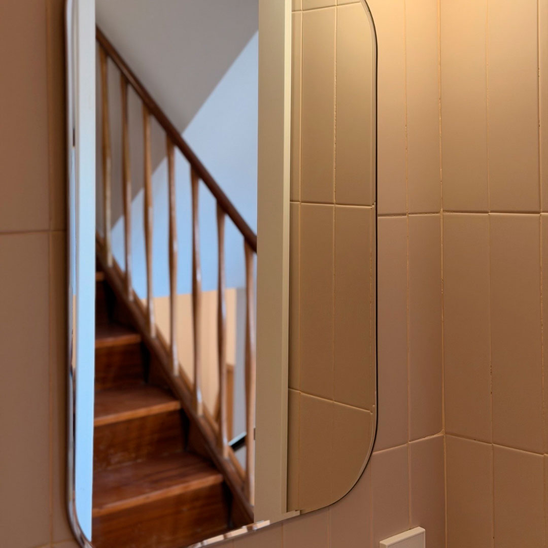
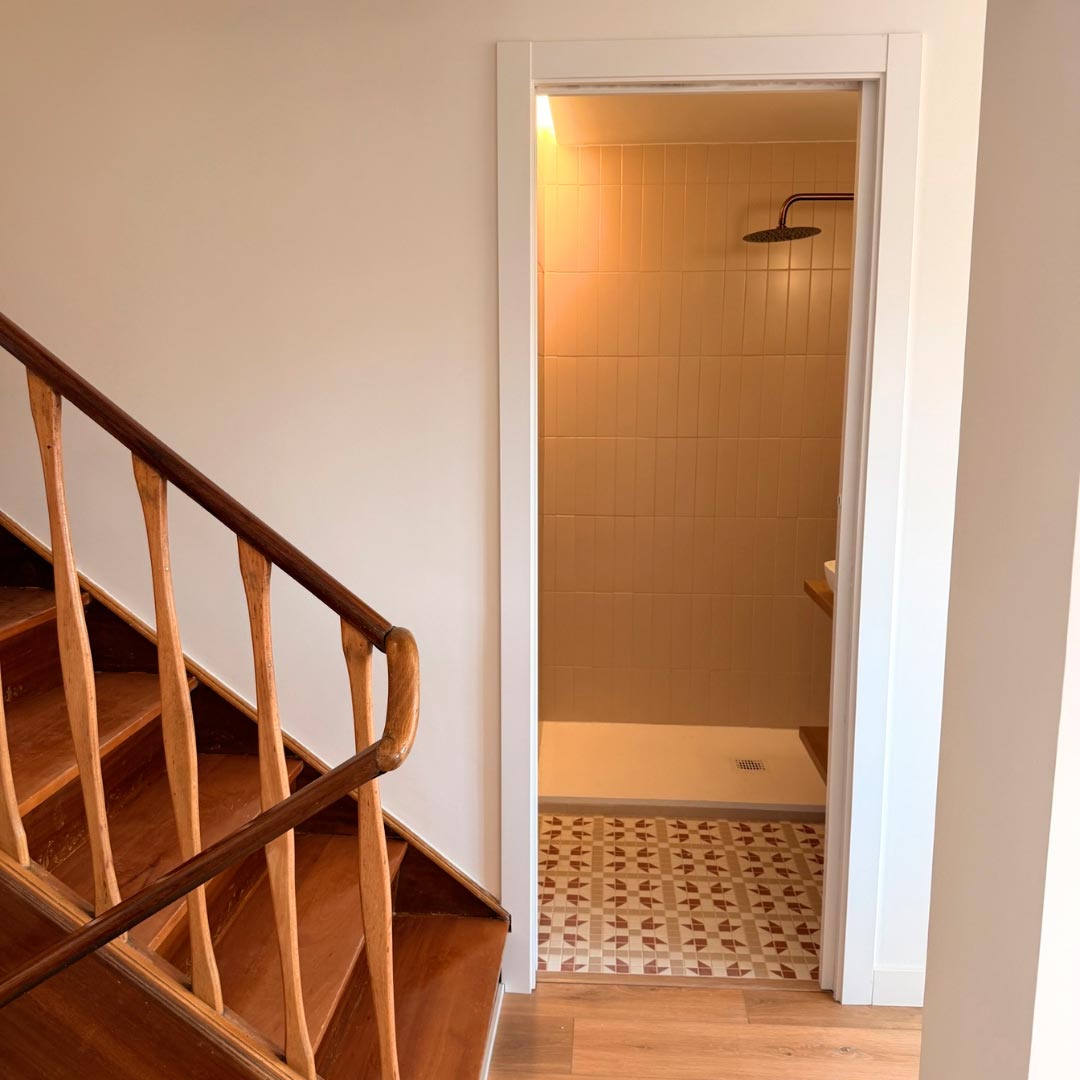
In the bathroom, the colour palette continues, but is interpreted in a different way. Flat Garnett and Flat Sand bring these warm tones onto the walls through a more serene composition.
Garnett adds depth, while Sand brings light and balance. The elongated format of the tiles also emphasises verticality, establishing an interesting dialogue with the architecture of a home arranged across different levels. The wooden vanity and metallic details complete the space, connecting it with the material language found throughout the rest of the project.
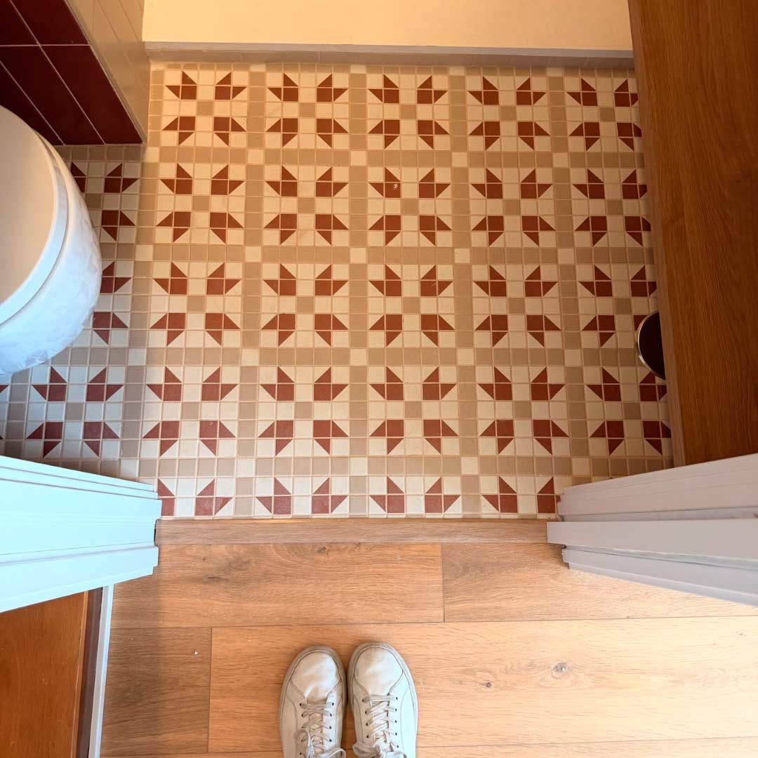
The flooring introduces a new dimension through Lancelot, from the Mintons collection. Its geometric pattern picks up the tones found throughout the bathroom and transforms them into a small-scale graphic composition.
The transition between this flooring and the wood is particularly interesting: two different surfaces that visually define each space while maintaining a sense of continuity through their shared colour palette.
Kit-Kat Snow Glossy, Flat Garnett, Flat Sand and Lancelot all feature different aesthetics and formats. Yet within the project, they share the same purpose: to create continuity through colour without making every space feel the same.
The home is therefore conceived as a journey. Colour appears, disappears and transforms from one space to another, accompanying the architecture and connecting all three floors. Because here, colour does not divide. It connects.