Decoration in red: passion and power without limits
- The meaning of the red colour
- The red colour in the decoration
- Red colour tiles to decorate your home
- How to decorate with red tiles your home?
- The red colour palette and its shades
- The red colour in psychology
- The red colour in nature
- The red colour on the table
- The red colour in style and catwalks
- The red colour in the painting
Decoration in red is an exciting way to add a passionate and energetic touch to any space. Red is the colour of love, emotion and determination, and its use in interior decoration creates a vibrant environment. In this article, we are going to explore how the red colour can be used to create attractive and brave decorations. We will also address the meaning of the red colour, its colour palette and shades, its psychological and natural presence, and its use in fashion and painting. This guide will give you the necessary tools to create a space full of life and personality using the colour red. All in red!
The meaning of the red colour
The red colour is one of the most potent and emotional colours across the whole spectrum. As we said, it is the colour of passion, love, emotion and determination. It represents force, vitality and energy. However, it has negative shades, and it also represents anger, risk or aggression. It is a colour that attracts attention and is associated with action and urgency.
In popular culture, red is related to love success and good luck in business. It is the colour of roses and cherries, symbols of love and romanticism. In advertising, the red colour is used to attract attention and create a sense of urgency. So, the red colour is the symbol of passion, emotion and vitality.
The red colour in the decoration
At this point, we can affirm red has an important role in interior decoration because it is considered a colour with full energy and emotion. Red is a versatile colour which can be used in different decorative styles, from the most traditional to the most modern.
How to use red in the different decorative styles?
- In classical decoration, red has been used to create warm and cosy environments. It can be used in curtains, pillows, carpets and upholstery details to add a colour and life touch to the decoration.
- In minimal decoration, red is used as a striking and surprising element, that breaks with the space monotony. It can be used on only one wall, in furniture or in an art piece to create an interesting focal point.
- In Nordic and Scandinavian decorations, red has been used to add a warm and contrasting touch to the space. It can be used in detail as pillows, carpets and candles for creating a cosy and warm environment.
- In bohemian decoration, red is used to create an environment with plenty of life and colour. It can be used in detail as pillows, carpets, upholstery and curtains to add an eccentricity and personality touch to the space.
- In contemporaneous decoration, red is used to create a modern and sophisticated environment. It can be used in detail as lamps, paintings and decorative objects to add a colour and life touch to the space.

The importance of the red colour in oriental decoration
In the same way, red colour is associated with different decorative styles, but one of the most important styles is the oriental style. Especially in countries like China and Japan, red is considered a traditional colour in these cultures, and that is the reason why, it is used in interior decoration as panel walls, curtains, carpets or other accessories.
Furthermore, red is a popular colour in rustic and rural decoration styles because it is considered for having a warm and cosy style. It is also used in minimal and modern decorations to add colour and personality.
Red colour tiles to decorate your home
From Dune, as tiles design leaders, we have a broad range of red tiles to cover all tastes and give an answer to all types of projects. For red tiles with a neutral style, ceramics in this tone breaks with monotony and invite to create a more risky interior design.
Thus, the Flat and Exa collections propose basic ceramic pieces to decorate each room. Its format and versatile ending make the Garnet colour perfect not only for each room but also for leisure areas and restoration.
In the same way, Tabarca also has the Garnet design framed inside the red shade. Its ultra-bright finish and its texture that imitates the handcrafted potters' work are without doubting its principles of differentiation.

We cannot either forget the Agadir collection in its Lava colour. The intensity of its red tonality and the richness of crushed ones makes this tile perfect for creating spaces with personality.

The Saudade collection in this Bermellón design is one of the best options for to who want a rustic decoration in which the red colour will be the main protagonist. This collection inspired by Portuguese ceramics offers a unique finishing to a project decoration.

Finally, as a novelty of this year, the Nusa collection of marble is all a declaration of intent. The traditional statuary marble mixes its design with the trendy red colour creating a unique interior design collection.

How to decorate with red tiles your home?
When it comes to decorating with red tiles your home rooms, there are multiple options. Creativity has no limits and respecting always tile uses and technical proprieties you can decorate with ceramics each house corner with. In the following lines, we offer you different ideas:
- Create a carpet in your living room with red tiles.
- Decorate the front wall of your kitchen with red tiles.
- Combine red hexagons in the coating of a bathroom wall.
- Lining a fireplace with ceramic pieces in red colour.
- Differentiate the toilet space in a bathroom with small-format red tiles.
- Decorate the shower wall and zone with red tiles.
In short, red is a fundamental colour to create a decoration with its personality. There are no limits when it comes to using this shade regardless of the decorative style you choose, only creativity counts. The only thing that counts is creativity. All in red!
The red colour palette and its shades
Red is one of the primary colours and can be mixed with other colours to create a variety of shades, such as pink, purple, brown and orange. Each shade has its personality and can be used to create different environments and styles.
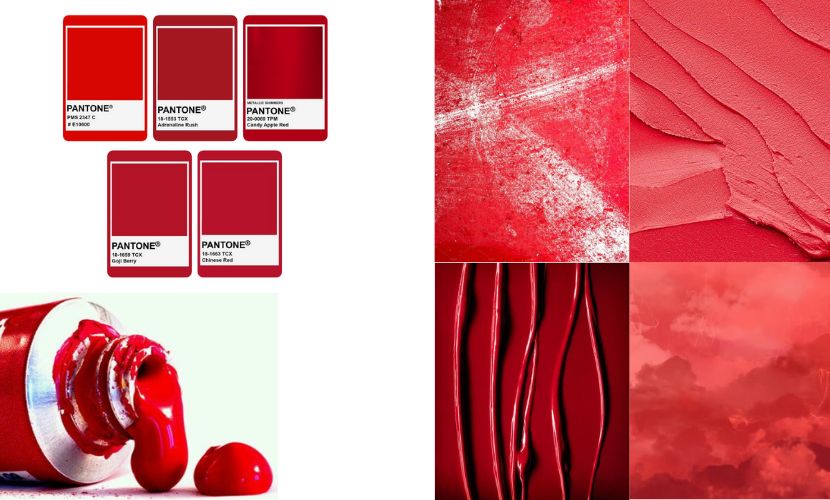
The red colour is not a monochromatic tone. It has a wide variety of shades and tones that can transmit different emotions and meanings. Some of the most common red shades can be:
- Cherry red: this shade has a colder and softer tone than traditional red. It associates with delicacy and sensuality and is often used to convey a sense of romance and love.
- Scarlet red: this shade, which is intense and vibrant, is associated with passion and emotion. It is a colour that attracts attention and is commonly used to transmit an urgency or importance sense.
- Bordeaux red: this shade is darker and dimmer than traditional red. It is associated with luxury and sophistication. It is a colour used to transmit an elegance and style sensation.
- Garnet red: this shade is similar to Bordeaux but has a warmer tone and is less opaque. It is associated with mystery and intrigue and is used to transmit a sensation of mystery and sensuality.
- Wine red: this shade is similar to the garnet but has a coldest and less opaque tone. It is associated with elegance and sophistication and is used to transmit a sensation of luxury and richness.
- Passion red: this shade is similar to traditional red but has a more intense and vibrant tone. It is associated with passion and emotion and transmits a sensation of urgency and importance.
As a result, and taking into account what each red tone transmits, its use in interior decoration helps create a specific environment. Therefore, it is important to choose the appropriate shade to achieve the desired effect.
Pantone and the red colour
Pantone, a company leader in the colour world, chooses the colour that will make trends in decoration, style, design or architecture every year. After studying for a while, its analysts choose what tonality will be at the forefront, and they announce it with great fanfare, catching the attention not only of art professionals but also society in general.
In this sense, Viva Magenta has been chosen as this year's Pantone colour. The colour of the year is a tone directly related to nature and transmits strength. This throbbing colour, in which exuberance promotes a happy and optimistic celebration, is opting for happiness and optimism.
Likewise, Living Coral red was the focus of trends during 2019. This warm tonality represents a clear symbol of confidence and optimism. According to Pantone, this tone is a mix of red and orange which represents vitality and connection with the natural world. At the same time, it emphasizes the importance of finding harmony in nature and our life.
The red colour in psychology
Red is a powerful colour and can have an impact on our emotions and behaviour. The red colour is associated with excitement, energy and hunger, as well as it is stimulating to some people. Nevertheless, it can also be overwhelming and unpleasant if it is used excessively.

Different psychologists and colour students have developed theories about the sense and effect of red colour on people. One of the most knowledgeable psychologists is the German psychologist Johann Wolfgang von Goethe, who, in his project “Theory of Colors”, highlights that red colour is the most powerful and emotional colour and has a stimulating effect on the nervous system.
Another psychologist who has investigated red colour is the American David Lewis, who in his book “The Secret Language of Color” affirms that red can pump up heart rate, blood pressure and sexual response in people. As well as it can be used to attract attention or transmit an urgency feeling.
Moreover, there are some studies which have demonstrated that red colour can increase attention, memory and reaction speed. However, it has also demonstrated that the red excess can unsettle and exhaust the nervous system. With all these things we can affirm that red colour is powerful and emotional. Thus, its interior decoration use has to be carefully considered to avoid the negative effect.
The red colour in nature
Red is not a colour that we directly associate with nature, but it plays a fundamental role there. This may be due to the power of fire and its role as a purifying element, which gives red a strong presence in the natural environment. Another element that is also directly related to the colour red is volcano lava, which has a tonality that conveys strength. Additionally, sunsets give us beautiful landscapes with a range of red colours.
In plants, the colour red is found in flowers, fruits, and leaves. For instance, roses are one of the most popular and symbolic flowers with an intense red colour. Numerous fruits also have red tones, such as apples, strawberries, and pomegranates. Red is also found in the leaves of trees and bushes, such as the maple tree and rhododendron.

In animals, the colour red is found in many birds, butterflies, and beetles. For instance, the cardinal is a bird with a large number of red feathers. The monarch butterfly has a wonderful tonality of reddish-orange on its wings, while beetles are known for their intense red colour.
In minerals, the colour red is found in different gems such as ruby, garnet, and spinel. Red is also found in minerals such as hematite or limonite, providing a wealth of colours for jewellery and costume jewellery.
The red colour on the table
Related to nature, we talk about the power of decorating a table with fruits, vegetables or decorative elements for creating warm and cosy environments. In this sense, the red colour on food is attractive and helps to open hunger. Apples, strawberries, cherries and tomatoes are rich in vitamin C and are the main elements to create colourful dishes with a high number of nutrients. Either we cannot forget red fruits. Raspberries and blueberries are perfect for giving colour to your table and surprising your guests.

Apart from fruits and vegetables, red is also found in other aliments and drinks. Without any doubt, red wine is a great example of this. Its intense red colour created by tannins and pigment grapes used for its elaboration is a clear identifier.
On the table, frequently, the red colour uses in dishes, glasses and napkins. It is also used to table decorations, as flowers and candles centrepieces. As we said before, this colour reflects warmth and whets the appetite.
The red colour in style and catwalks
Unsurprisingly, red is a popular colour in fashion and has been used in clothing and accessories since immemorial times. It is a striking and powerful colour that creates a fashion statement. From Valentino's designs to Chanel's iconic lipstick to the soles of Louboutin's heels, the colour red is a force to be reckoned with in fashion.

Then, we do a review of designers who have exalted the red colour in their creations:
- Valentino: the Italian designer Valentino Garavani is famous because of his use of red in his designs, especially in his night clothing collection. His red night dresses became famous in the 1960 and 1970 decades.
- Ralph Lauren: the American designer has used red in many of his designs, especially in his casual and sports clothing collection. His red colour use has become iconic in style.
- Giorgio Armani: the Italian designer has used this tone in his creations. Nobody forgets his suits or casual designs which red is the focus.
Alexander McQueen: the British designer has chosen the red colour for its haute couture clothing collection. - Oscar de la Renta: the Dominican designer combines the red colour perfectly for his purposes. His night dresses are a point of reference.
- Gucci: the Italian brand has been recognised for its use of the red colour in its designs, especially in its clothing and accessories collection. Red has become one of Gucci's iconic colours always combined with haunter’s green and navy.
The red colour in flamenco and bullfighting
If there is something that Spain has is its direct connection to the red colour, which is directly associated with flamenco and bullfighting. On the one hand, in flamenco and, more concretely, in style, red colour is one of the basic wardrobes. Combined with black and white, red add presence, strength and race and it is all a reference in flamenco clothing. In the same way, in bullfighting, red has a special meaning. The bullfighter embroideries wears in red and are a main element in the bullfighting tradition.

The red colour in the painting
The red colour has been a recurring element in painting throughout history. Red had been used to represent different emotions and concepts in painting. So, in renaissance painting, red was used to represent passion and emotion. The Spanish painter Diego Velázquez, for instance, used red in his artworks representing fire and fury.
In baroque paintings, red has been used to represent opulence and power. The French painter Peter Paul Rubens used red in his artworks to represent richness and luxury. According to impressionist painting, red has used for representing light and movement. The French painter Claude Monet used it in his artworks representing fire and the sun.
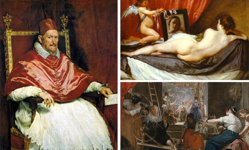
In abstract painting, red has used to represent emotion and energy. The American painter Mark Rothko uses in his artworks representing passion and intensity. Likewise, in Contemporary painting red has a wide variety of meanings. Painters such as Gerhard Richter, Jenny Saville and Anselm Kiefer have used red representing violence, power and politics, among others.
In short, red is one of the most vibrant colours in the chromatic palette and it is full of nuances, which give it that character that makes it a safe bet to fill any space with personality. If you need help or more inspiration to include red in your decoration, do not hesitate to contact us.