Decoration in blue: Calm and serenity for interior design with a Mediterranean touch
With summer’s arrival, the colour blue undoubtedly takes the centre of the stage. There is nothing more representative of the summer season than the sea, the perfect antidote to alleviate the heat. That is why, we want to take this opportunity to tell you everything that this colour, including the range of cold tones, can bring to the decoration of an architectural project. Reflecting the Mediterranean and the purest stability, in the following lines we will analyse the colour blue’s symbolism in decoration. Take note!
The meaning of the colour blue
The colour blue is known thanks to its ability to transmit calm and serenity. It is a cool and relaxing colour that is associated with tranquility and emotional stability. In Western culture, it is related to honesty and loyalty and it is considered a traditional and serious colour, perfect for transmitting sensations. However, depending on its use it can also contain negative connotations, such as melancholy or sadness.

Moreover, the colour blue has a number of cultural and symbolic meanings. In the past, the colour blue was associated with religion and spirituality because it was considered the colour of heaven (sky) and the gods. In Western culture, blue is associated with calm, serenity and trust. It is also considered a relaxing and calming colour that helps to reduce stress and anxiety. Furthermore, blue is associated with intelligence, wisdom and honesty. Therefore, we can assure you that it is an ideal colour to use in work and study spaces.
Because of all the previous reasons, it is clear that when decorating interiors, blue is used to create relaxing and calming environments. Thus, many decorators choose this shade to decorate bedrooms and bathrooms, as it helps to improve the quality of sleep and reduce stress.
Pantone and the symbolism of the colour blue
Pantone, as a globally recognised entity because of its system of colour identification and communication, has designed several shades of blue over the years. These blue colours have been selected for their special nuances and have directly influenced fashion and design trends.
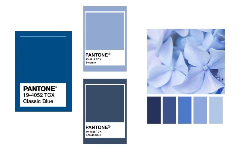
- Classic Blue (Pantone 19-4052): Designated as the 2020 Colour of the Year, Classic Blue is a deep and timeless blue shade. It is characterised by its elegance and versatility and can be used in a wide variety of design applications.
- Serenity Blue (Pantone 15-3919): chosen as the 2016 Color of the year, Serenity Blue is a soft and calming shade. It evokes a sensation of tranquility and peace, and it is ideal for relaxing and serene environments.
- Ensign Blue (Pantone 19-4026): named the 2012 colour of the year, blue indigo is a deep and mysterious shade. It combines elements of blue and violet, and it is used frequently in sophisticated and dramatic designs.
This selection influences several industries, such as fashion, graphic design, interior design and more, and serves as inspiration for the creation of colour palettes and trends in the design world.
The importance of the colour blue in interior design
As we have indicated previously, in interior design blue is a key element to create a harmonious, calm, and relaxing environment. It is a popular colour for walls and ceilings in bathrooms or bedrooms, as it helps to create a sense of freshness. It is also used in living rooms and kitchens to create a comfortable and relaxed atmosphere.
Decorating in blue is a trend that has gained a lot of popularity in recent years, and it is not surprising, as blue is a serene and calm colour. It is ideal to create cosy environments and it is very versatile, as it can be used in different decorative styles.

Blue is a colour that adapts very well to different decorative styles, from minimalist to traditional styles. In the minimalist style, blue is used to create a simple and organised environments, while in the traditional style, blue is used to create a warm and cosy atmosphere.
In interior design, blue can be used in different ways, from wall and floor finishes to textiles and accessories. It can be used in walls with light blue tones, in order to create a fresh and relaxing atmosphere, or in furniture and accessories with darker blue tones in order to create a sophisticated atmosphere.
Blue in the Mediterranean style
The Mediterranean style is one of the decorative styles that makes the most use of the colour blue. Blue symbolises the sea and the sky, fundamental elements in Mediterranean decoration and architecture. The colour blue is used in walls, ceilings, floors, textiles and accessories to create a fresh and relaxing atmosphere and to evoke the sensation of being in a warm and cosy place by the sea.
The Mediterranean style is characterised by the use of light blue soft tones, such as sky blue, navy blue or turquoise blue. These tones are combined with white and beige to create a neutral and relaxed atmosphere. The textiles, such as curtains and cushions, are also often in shades of blue to complement the decoration.

Moreover, the Mediterranean style is characterised by the use of decorative tiles with geometrical and floral motifs in shades of blue. These tiles are used in walls and floors to add a decorative touch and to evoke the feeling of being in a typical house on the Mediterranean coast. Hydraulic designs and small format tiles in gloss finish are combined with wood and natural textiles to achieve the perfect look.
Blue-coloured tiles to decorate a project
If you want to use blue tiles to decorate your project, at Dune we have a wide and varied range of products in this colour. Let's start with the basics. The series Flat and Exa offer us small format tiles, perfect for the colour blue to flood any room.

In the same way, for those looking to get the most out of ceramic decoration, the series Altea, Agadir, Barro y Tabarca offer us different shades of blue with a gloss effect finish that breaks all the moulds. Additionally, its finish emulates the effect of handcrafted work on clay and, thanks to the reliefs and shading, these tiles allow us to create unique projects.

On the other hand, for those who want to escape from neutrality and want a decoration with a strong character, the hydraulic and geometric designs of Doria, Valencia o Saudade are perfect to elevate the category of any project.

Similarly, for those looking to escape from the conventional, the Baikal series of marble-effect porcelain tiles is perfect. This collection reinvents the traditional veins of marble and immerses them in the blue colours of this icy lake located in Russia.

Blue tiles for swimming pools design
We cannot ignore the use of the colour blue when designing and creating swimming pools. This colour is perfect for bringing water to life. For this reason, and following the current trends in swimming pool decoration, we have created the Tahiti series, a reinvention of the Balinese stone inspired by the beautiful landscapes of this Pacific island.

Thanks to the use of this colour we manage to create a shiny effect and movement that emulates the sea waves and invites you to create a tropical paradise without having to leave your home.
How to use blue tiles for interior decoration?
The use of blue tiles in interior decoration can be an excellent way of adding colour and style to a space. Here are some ideas on how to use blue tiles in decoration:
- Feature wall: You can create a feature wall with blue tiles in a room. Choose a wall that is a focal point, such as the wall behind the bed in the bedroom or the main wall in the living room. The blue tiles will bring the room to life and create a visual impact.
- Bathrooms and kitchens:
You can create a feature wall with blue tiles in a room. Choose a wall that is a focal point, like the wall behind the bed in the bedroom or the main wall in the living room. Blue tiles will bring the room to life and create a visual impact.
- Mosaics:
Blue tones can also be used to create mosaics or patterns on floors, walls or even countertops. You can play with different shades of blue and combine them with other colours to obtain a unique and eye-catching design.
- Accessories and decorative details:
Apart from using blue tiles on big surfaces, you can also incorporate them into small details and accessories. For example, you can use blue tiles in the frame of a mirror, on a shelf or on a side table.
Remember to bear in mind the size and style of the room when choosing blue tiles. If you have a small space, you may want to opt for lighter tiles to prevent the room from looking overwhelming. You can also combine different shades of blue to add depth and dimension to your design. Have fun experimenting with blue tiles and create a unique design!
Blue and psychology
On a psychological level and associated with what we have commented previously, the colour blue is considered a relaxing and calming colour. It is related to the sensation of security and confidence and is often used in certain therapies to help people reduce stress and anxiety. Moreover, blue is also associated with intelligence and creativity, there are studies that show that it helps to improve memory and concentration.

Thanks to the psychological properties that this colour possesses, blue is directly associated with the autism awareness movement and is a true reflection of advocacy and inclusion. Blue was chosen because it is considered a serene and calming colour, reflecting the need for support and understanding for people with autism and their families.
In this sense, we cannot ignore the project by Marta Rangel and Amanda Miranda in which they decorated a bathroom in shades of blue, with the important presence of the Stripes Denim tile to achieve the perfect atmosphere that a child with autism needs. Undoubtedly, a project that even the slightest detail has been thought of.
Blue colour in nature and the environment
As we mentioned at the beginning of this post, the colour blue has a key presence in the environment. From sky to earth, we find this colour as the representation of water, one of the key elements of nature. The presence of the colour blue in nature has a great impact on our perception and our relationship with the environment. Blue is a relaxing and calm colour, that invites to reflection and contemplation, making it an ideal colour to use in places of meditation and contemplation.

The environment-related colour blue also has an impact on architecture and interior design. A view of the sea or the blue sky from a window can significantly improve people’s quality of life and mental health. Because of that, in interior design, blue tones are used to create a relaxing and calming atmosphere.
Blue is one of the most prevalent colours of nature and it has a big impact on our perception and our relationship with the environment. The sky and the sea are two evident examples of the presence of blue in nature, but there are also many flowers and plants that have shades of blue in their petals. Here are a few of them:
- Blue iris
- Lavender flower
- Cornflower
- Lobelia
- Sage
- Delphinium
- Knapweed
- Clivias
- Bellflower
Blue in fashion and on the catwalks
In fashion, blue is a classic and timeless colour. It is one of the most popular colours on catwalks all over the world and is used to create a wide variety of styles, from minimalism to maximalism. Blue is also used in fashion to create a sensation of elegance and sophistication and, as a result, it has become the new black that floods our wardrobes.
For these reasons, through the years blue has been consistently a part of fashion and is one of the most popular colours among fashion designers. Many designers have used blue as the main colour in their collections, whether in clothing, accessories or in the decoration of their fashion shows.
A clear example of this is Yves Saint Laurent, who uses blue in his collections to create an elegant and sophisticated atmosphere. Another designer who has chosen blue as his main colour is Giorgio Armani, who has used different shades of blue in his men's suits and in his evening wear for women. Ralph Lauren also opted for blue in his designs of women’s and men's clothing, creating a classic and sophisticated aesthetic.

The Italian designer, Valentino, who is a red icon, has also succumbed to blue for his high couture collections and his line prêt-à-porter creating an elegant and sophisticated aesthetic. Another example is the French designer, Christian Dior, who has used blue in his eveningwear and in his accessories to create a glamorous atmosphere.
Nowadays, many designers keep using blue in their collections, whether in clothing, accessories or in the decoration of their fashion shows. That is why blue is an excellent option for interior decoration, not just on a textile level but also on any level.
Blue in painting
The colour blue has been used in painting since ancient times and has been considered one of the most precious and valuable colours. The ancient Egyptians already used blue pigments in their paintings and in the Middle Ages, the lapis lazuli, a blue mineral, was really valuable because of its scarcity and difficulty to be processed.
In Renaissance painting, blue has been used to represent transcendence and spirituality. The Renaissance artist, Leonardo Da Vinci, used this colour in many of his paintings to represent calm and serenity. Another Renaissance artist, Vermeer, used blue in his famous painting “The Girl with the Pearl Earring” to create a mysterious and sophisticated atmosphere.
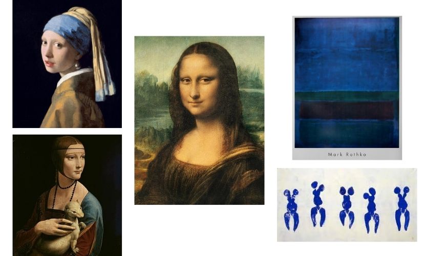
In contemporaneous painting, blue continues to be a popular colour among artists. The German artist, Yves Klein, honouring his surname, he chose blue as the main theme in his works, creating a unique and distinctive aesthetic. Another contemporary artist, Mark Rothko, used blue in his famous abstract paintings to create a contemplative and meditative atmosphere.
Blue in the cinema
As we have been analysing, blue is present in many artistic representations and cinema could not be less. In this case, colour is used as a tool to tell stories and transmit emotions, being key to representing different feelings, from sadness and melancholy to calm and serenity.
In classical cinema, blue has represented nostalgia and loneliness. The famous cinema director, Ingmar Bergman, used blue in many of his films to create a melancholic and sad atmosphere. Another director, Stanley Kubrick, used blue in his film "2001: A Space Odyssey" to represent tranquillity and the majesty of space.
In contemporary cinema, blue remains a popular colour among film directors. The French director, Jean-Pierre Jeunet, used blue in his film "Amelie" to create a fantasy-like and magical atmosphere. Another director, Terrence Malick used blue in his film "The Tree of Life" to represent the beauty and the majesty of nature.
Blue in architecture
In architecture, we can identify 2 types of uses of the colour blue. On the one hand, directly by being an important part of decoration or indirectly by boosting the sea views of the surroundings.
On the other hand, this tone is often used to create a sensation of depth and wideness. It is a popular colour for roofs and exterior walls of buildings, as it helps to create a sensation of freshness. It is also used in interiors to create a calm and relaxing environment, while also looking to create a contrast with the urban environment.
This colour has been used in architecture since ancient times and keeps being a popular trend. Many architects have used blue in their projects to create relaxing and calm environments. An example of this is the famous architect Frank Lloyd Wright, who used blue in his single-family home projects to create a sensation of harmony and tranquility.
Another architect who used blue in his projects is Le Corbusier. In his project "Housing Unit" in Marseille, he used blue on the facades to create a contrast with the urban surroundings and to create a sensation of calm and serenity. Furthermore, blue was also used in the design of interiors to create a perfect atmosphere.
Blue cities around the world
Undoubtedly, the use of blue in architecture is directly related to the coastal Mediterranean cities. Stamps such as those of the Greek Islands, cannot be understood without the colour blue combined with white. At the same time, the Valencian town Altea is easily recognisable by the blue of its roof tiles.


We cannot forget Chefchaouen, in Morocco. This locality is known as “The Blue Town” as much part of its buildings and streets are painted in bright blue tones. Similarly, in India we can find Jodhpur, known as the “Blue Town of India” because of the predominance of this colour in its houses. We can also find Sidi Bou Said, in Tunisia, and Blaubeuren, Germany, are representative locations of the use of this colour in buildings and urban architecture.
The choice of blue color in decoration not only brings serenity and calmness to spaces but also infuses an air of sophistication and versatility. This timeless hue can transform any environment into an oasis of tranquility, providing a perfect canvas to express creativity and personal style. Decorating in blue is more than just a chromatic choice; it's a statement of elegance and harmony in our homes!