
Decoration in pink: sweetness without additives
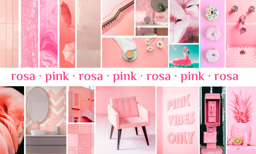
We continue researching chromatic trends and their influence on indoor decoration. In this instance, we have pink, a tonality that invites tranquillity, emulates sweetness and recalls elegance. It is not only a colour but pink is also the true protagonist in the design world, from fashion design to architecture and go-ahead interior design. With its large variety of shades, from the softer pinks to the stronger ones, this tone has become an essential decoration element. With its ability to convey warmth and versatility, pink has become a popular choice for residential and commercial decorating projects.
In that sense, our work as ceramics decoration experts focuses on the exhaustive analysis of chromatic trends to choose and design colour palettes for putting life into the projects. Thus, knowing the proprieties that each tone coats in a design is essential to creating projects that add quality. Hereafter, we are going to analyse all the variables that can have an influence when choosing a pink decoration.
What does pink mean?
To use pink in decoration, we have to consider its symbolism. Pink is a tone associated with warmth, tranquillity and love. Since ancient times, it has been used to represent femininity and delicateness. In the Occidental culture, pink has been associated with romance and sweetness.
However, the pink meaning can also vary depending on its tone. For instance, the softer tones tend to be related to innocence and pureness, while the strongest tones transmit energy and vitality. Therefore, pink is a versatile and multifaceted tone used to transmit a broad range of emotions and meanings in decoration. The key is to know how to use it correctly.
Pink in decoration
Pink offers a versatile colour palette that can be used in many different styles, from the most classical ones to the modern ones. Therefore, it is important to choose the variant of pink that best suits the tastes and decorative style objectives of each space. Thus depending on the shade and hue chosen, pink can add significant elements to a space.

How to use pink in the different decoration styles?
Hereafter, we are going to take a look at the most acclaimed decorative styles, among which the colour pink is a winner:
- Shabby Chic: this style often combines antique and vintage pieces with a palette of pastel and soft colours, including pink.
- Nordic: Nordic style often includes a large range of soft and pastel colours; pink can be an excellent choice to add a touch of warmth and softness to a space.
- Gothic: Deep and dark pink can be an excellent choice for gothic spaces with a focus on drama and elegance.
- Bohemian: Bohemian style is characterised by its free spirit and combination of vibrant elements and colours. Pink can be an excellent complement to a bohemian space, whether in a bright or pastel shade
- Minimal: Pastel pink can be an excellent choice for minimalist spaces, as it can add a touch of warmth and softness to a space without being too invasive. It is an alternative to white.

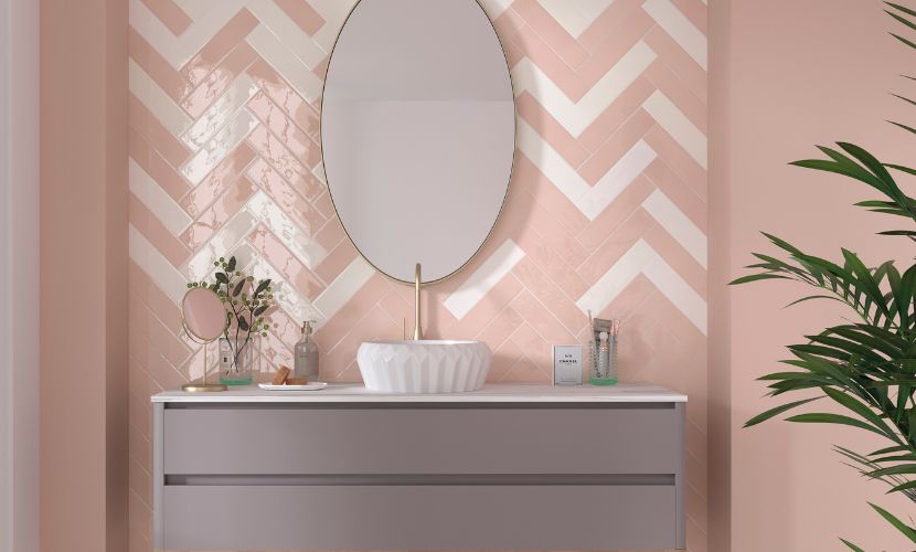
Tiles in pink for decorating a project
At Dune we constantly search for innovation when creating new tile collections. For this reason, pink tiles are always present in our collections, either as the main colour or as a colour to add some nuance to the main pieces of a series.
We can highlight the Tabarca series in which Pink has been one of the best sellers. In square and rectangular sizes, this ceramic collection stands out for its chromatic palette. The de-toning brings versatility to the tiles and makes the differentiation between the faces give character to the series.

On the other hand, Altea purposes a relaxed version of tiles in pink. In this case, the graphic variation between pieces is not significant. Its Talco and Coral designs are examples of how pink can integrate perfectly into small-format ceramics.
We also have the Agadir model with its Amaranto colour as an example of how to include pink in the Zellige ceramics.

Apart from these glossy tiles, the Valencia and the Berlin series offer tiles with matt finishes to create vintage spaces.

How to use pink tiles to decorate a project?
To end up this article, we want to give you some tips to use pink tiles because they are a lovely option to decorate a project. Here you have some tips about how to use pink ceramics effectively:
- Feature walls: You can use pink tiles to highlight a wall in a room. Whether in the kitchen, bathroom or any other area, pink tiles can add a touch of warmth and femininity. Consider combining them with neutral or white tiles to balance the look and keep the room from looking overwhelming.
- Mosaics or patterns: Pink tiles can be used to create mosaics or patterns in different areas of your project. For example, you can design a pattern on the kitchen floor or bathroom shower wall. This technique can add a touch of style and originality to the decor.
- Colour combinations: pink tiles can be combined with other colours to achieve a balanced and harmonious look. For example, you can combine them with neutral tones, such as white, grey or beige creating a soft and elegant atmosphere. You can also add accents of complementary colours, such as green or blue, to create an interesting visual contrast.
- Accessories and details: in addition to using pink tiles on larger surfaces, you can incorporate them into accessories and decorative accents. For example, you can use pink tiles on the edge of a mirror or on a shelf to add a splash of colour. You can also use them to create a decorative panel, for example, in a restaurant.
- Retro or vintage style: pink tiles have a nostalgic charm that lends theirself well to retro or vintage styles. You can use them to recreate a mid-century or 1970s aesthetic. Combined with the right furniture and accessories, pink tiles can help create an authentic vintage atmosphere.
Remember that the choice of pink tiles will depend on the style and vision you have for your project. It is essential to consider the size of the room, lighting and other decorative elements to achieve a balanced and aesthetically pleasing design.
Pink in psychology and health
Pink directly concerns our emotions and states of mind. Psychological works and research have shown that pink has a calming effect on the nervous system and helps to reduce anxiety and stress levels. In addition, it has also been shown that the colour pink can improve concentration and increase feelings of well-being. These effects are partly due to the subconscious perception we have of the colour pink, which is often associated with the idea of protection and security.
In consequence, when decorating a room, if we use pink, we would consider the effects that could create in our mind. If we want to create a warm and natural space, the brush-stokes of this tone cannot be missed.
Furthermore, pink is also used as a hope and healing symbol, especially in the struggle against breast cancer. This colour is a clear representation of the tide of women who, day by day, join the fight against this disease. This colour has become a clear symbol to raise awareness of the importance of early detection and the fight against breast cancer.

So, every 19th October, the whole world turns pink to highlight the need to continue research to find a definitive cure for breast cancer. In addition, many organisations, companies and institutions produce pink-themed products and accessories to donate the money raised to breast cancer research and treatment.
Pink and its relationship with the female gender
Pink has been associated with the female gender for a long time. The relationship has originated in popular culture and has been carried on fashion style industry, decoration and other aspects of the current life. In the XX Century, pink was used for girls and blue for boys had promoted. Although this association has changed nowadays, and an effort has been made to advocate for an inclusive gender association, the association between pink and the female gender is still prevalent in society.
Nevertheless, it is essential to highlight that this association is only a cultural stereotype, and it does not reflect the reality in which colour can be valued and used by people of any gender. In the end, the relationship between pink and the female gender is subjective and depends on the individual perceptions of each person.
The chromatic range of pink
Considering pink as a versatile colour, and it can be used in modern and classical spaces, its chromatic range allows one to adapt pink to the demands of users who do not accept each thing. Its principal value is the capacity to transmit calm and serenity, as well as being associated with a sense of warmth and sophistication, being perfect for interior design.
It should be noted that pink is found inside the warm colour range and is featured by its soft and delicate appearance. There are a large variety of pink tones, each one with its own distinctive features. Hereafter, we look over the most significant ones:
- Light pink: also known as pastel pink or baby pink, this tone is soft and evokes a sense of tenderness and delicateness. It is a popular colour in infant bedrooms and is associated with innocence and sweetness.
- Bubble gum pink: this tone is vibrant and bold. It is similar to the strawberry bubble gum colour. It is a glossy and energetic pink that can be easily remarkable. It is frequently used in graphic design and fashion style to create a visual impact.
- Salmon-pink: this tone is similar to the salmon meat, with an orange or peach shade. This warmth and sophisticated pink transmits a sense of calm and elegance. It is often used in house decoration and fashion style.
- Pink fuchsia: pink fuchsia is an intense and flashy colour, close to magenta. It is a vibrant and daring pink that transmits energy and vitality. It is frequently used in fashion style and design to create impact and eye-catching accents.
- Pale pink: also nicknamed dusty pink, this tone is soft and subtle with a light greyish shade. It is a versatile pink that can be used both in elegant and sophisticated environments and more relaxed and romantic spaces.
- Nude pink: this colour is a combination of pale pink with neutral shades, such as beige, grey or even slightly brown tones. This mixture creates a soft and subtle colour which resembles the natural skin tone. This colour stands out for its neutral and timeless look, which blends well with a wide range of colours and styles.
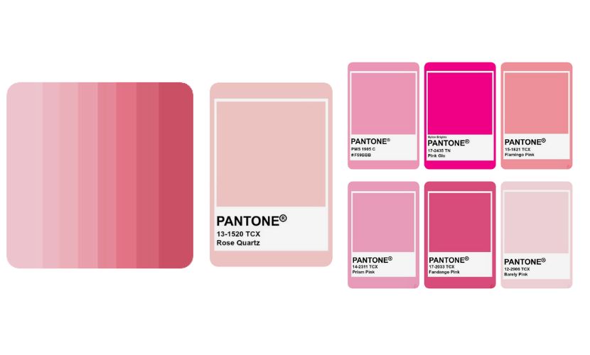
Pantone and its work with pink-themed
Pantone is the leading company in the colour and visual communication world and is responsible for setting trends in shades and colour ranges. Every year, Pantone chooses the colour of the year which is on trend in design and decoration. In 2016 the colour chosen was “Rose quartz”, a soft and calm pink. Since then, pink has been an ever-growing trend in the design and decoration world.
Pink has been chosen on different occasions as the colour of the year by Pantone. Not only in 2016 but in 2019, the colour of the year was “Living Coral” a bright and vibrant tone of coral pink. On both occasions, these colours had chosen because of their capacity to transmit a sense of warmth and connection, as well as to reflect on the importance of nature and balance in an increasingly technological world. These colours demonstrate the relevance and versatility of pink in today's culture.
Pink in nature
This colour is very present in the natural environment Without a doubt, flowers are a significant element in which pink is present. We highlight that this colour is common in a lot of flowers and is considered a symbol of love, gratitude and affection. Here are some of the flowers in which pink plays an important role:
- Roses
- Peonies
- Lilies
- Gardenias
- Gladioli

In this sense, we can ensure that pink flowers add versatility and sensibility to any space. Using these natural elements as a fount of inspiration for interior designs ensures to create special spaces, without forgetting the aroma and perfume that natural flowers add to interior rooms.
We cannot close this section without talking about pink in animals. We have no doubts that the flamingo is the animal par excellence representing pink. During the last few years, it has become very fashionable due to the good vibrations it transmits. Its beauty has become a source of inspiration for designers who have used it as a symbolic element in interior design.

Pink in the cinema and cartoons
Pink can have different influences in animated films and cartoons, depending on the context and the message that it wants to transmit. Although there is no strict rule, the colour pink is commonly associated with the following characteristics:
- Femininity: pink has traditionally been seen as a colour associated with femininity. In many cartoons and animated films, especially those aimed at children, the colour pink is often used to represent female characters or elements associated with femininity, such as princesses, fairies or toys for girls. This association with femininity can have an impact on the representation of gender in animated films although there has been a shift in thinking and attempts to remove gender from these representations recently.
- Sweetness and tenderness: soft pink transmits a sense of sweetness, tenderness and delicacy. In animated films and cartoons, the use of pink in characters, scenarios or visual elements can contribute to creating a nice and loving environment. It can be specially used in histories aimed at a youth public or in nice and charming characters.
- Romanticism: pink is also related to love and romance. In some animated films, pink can be used to represent romantic moments or highlight the relationship between characters. For instance, in a princesses and princes story, pink is often present in romantic scenes or visual elements related to love.
Clear examples of the use of pink as a representation of an animated cartoon are the Pink Panther, Sleeping Beauty, Daisy or Hello Kitty. All of them use pink as a colour representative of their personality.

Pink in architecture
Thanks to the proprieties of pink, its paper in architecture is relevant. This tone can be used to highlight specific elements, to make a statement of intent and, of course, to convey a sense of warmth and well-being.
Pink has found its place in architecture and the building sector and is used even more for creating cosy and elegant spaces. Since pink facades to rosy indoors, pink is used to highlight architectural elements and add a soft and feminine touch to buildings.
The use of pink in architecture can also be a way to attract attention and appeal to public opinion, especially in urban and modern environments. For example, some buildings with pink facades have been designed to stand out in the landscape and to be seen as a work of art.
In addition, pink is also used in architecture to convey a sense of warmth and well-being due to its proven calming effect on the nervous system. The use of pink in the interior decoration of a building can also help to create a more relaxed and welcoming atmosphere.
Architects who fall in love with the colour pink
Ricardo Bofill is a Spanish architect known for his futuristic and experimental projects. Bofill has used pink in some of his buildings, creating a unique and distinctive effect. As a result, he has designed outstanding buildings with pink as their flagship. In the following lines, we take a look at the most emblematic ones.

La Muralla Roja (lit. “the Red Wall”) is the most knowledge building from Ricardo Bofill, especially thanks to the advertising that Instagram has made during the last years becoming one of the most repeated photos on this social media. Located in Calpe, this building is inspired by the miscellany of Mediterranean and Arabic architecture. Its composition responds to a geometric distribution centred on the Greek cross typology. As a result, the shape of the building gives rise to a series of interconnected courtyards from which the dwellings are accessed.
On the other hand, La Fabrica (lit. “The Factory”) is a former cement factory that Bofill transformed into his architectural studio and a cultural centre. The facade of the building is clad in a pale pink that is combined with stone and steel details, creating a dramatic effect.
It also highlights la Torre de la Muerte (lit. “the Tower of Death”), one of the most iconic constructions made by Bofill. A vibrant pink covers the facade of this building. It contrasts with the texture of the concrete blocks and the colour of the rest of the construction. Finally, we cannot forget Les Halles, an urban renovation project located in the centre of Paris. Bofill included pink in the facade of one of the buildings of this project, creating an elegant and sophisticated effect.
Apart from Ricardo Bofill, there are a series of architects who have also chosen pink for their iconic creations:
- Zaha Hadid: the famous architect has used pink in some of her projects, including the SOHO Residences in Beijing (China). A pale pink covers the curve and waving facade of this project. It makes it highlighted in the urban landscape.
- Philippe Starck: the French designer and architect is known because of his provocative use of colours on his projects. An example is the Hudson Hotel, in New York, which has a pink facade and rosy elements combined with bright colours indoors.
- Terunobu Fujimori: the Japanese architect is known because of the use of pink on his buildings, including his “Takasugi-an Tea House” in Gunma (Japan). A vibrant pink recovers the wood structure. A vibrant pink coats the wooden structure, which makes it stand out in the surrounding rural landscape.
- David Chipperfield: the British architect has used pink in some of his projects, including the Jumex Museum in Mexico City. The museum's pale pink facade highlights the urban landscape and complements with the wood and glass finishes.

In conclusion, pink is not just a hue but a vehicle to express various emotions, styles, and meanings. Its versatility, ability to influence our mood, and omnipresence in different aspects of everyday life consolidate it as an eternally relevant color in the world of design and creativity. Its well-understood use and careful integration can transform spaces and experiences, leaving an indelible mark on the aesthetic and emotional perception of those who experience it.